

How to visualise geospatial data by location to inform better decision making
Organisations produce so much data these days that it can be difficult to manage and make sense of it all – especially for those who aren’t data scientists. But using data visualisation helps communicate data insights in a way that makes it easy for everyone in the business to understand data and its importance.
Data visualisation can be used to provide more insight than traditional descriptive statistics can’t. It can also be used to see distinct patterns and observations that won’t be immediate if you wade through data line-by-line.
This allows companies to gather and quickly act on their data. Faster, informed decision making makes organisations more responsive in an increasingly competitive market.
I’ve put together a very short tutorial on how to use the PowerBI preview tool called Shape Map to help you visualise data across regions. Shape Maps are unique in its ability to use custom maps based on TOPOJSON files. It distinguishes the different regions of the map by using different colours in a way that’s easy on the eye.
Prerequisites
- Enable the preview feature Shape Map Visual
- The UK-Counties TOPOJSON file – download it here
- The sample use case data – download it here
Enable Shape Map Visual
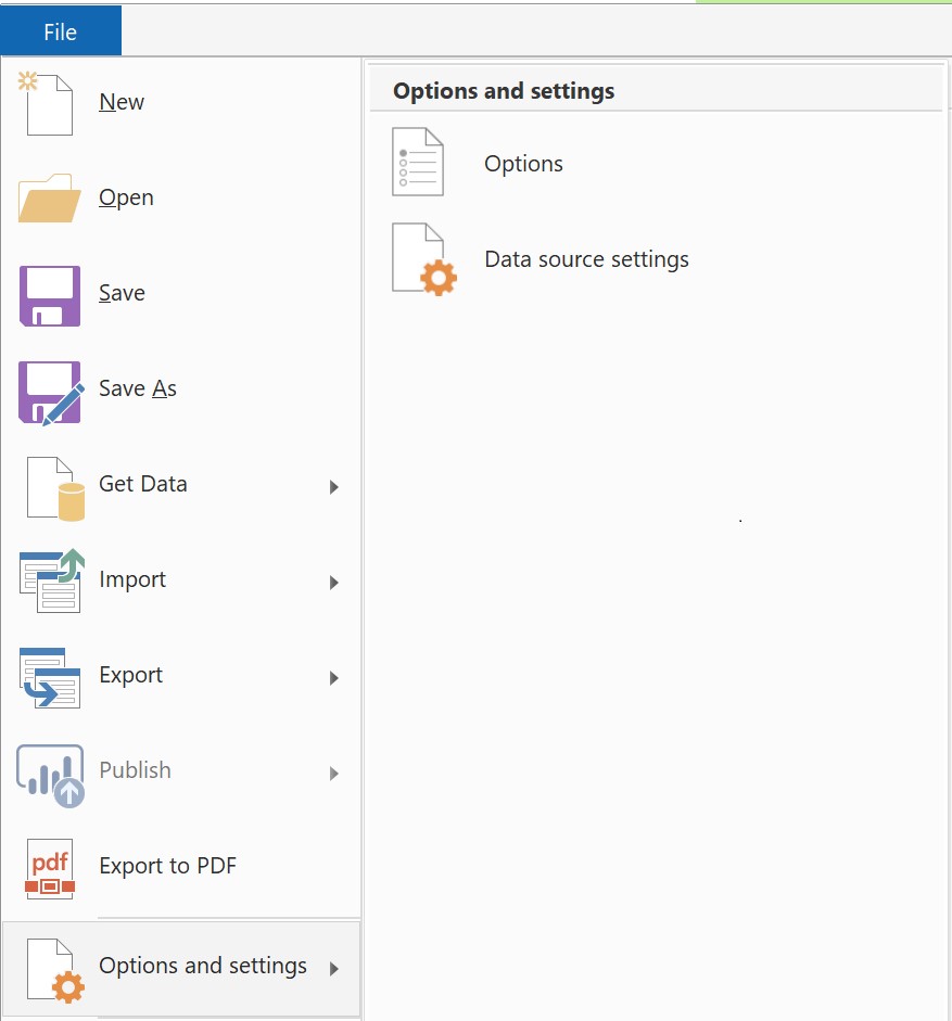
Once you have PowerBI go to Options by clicking on File, then Options and settings, then finally Options:
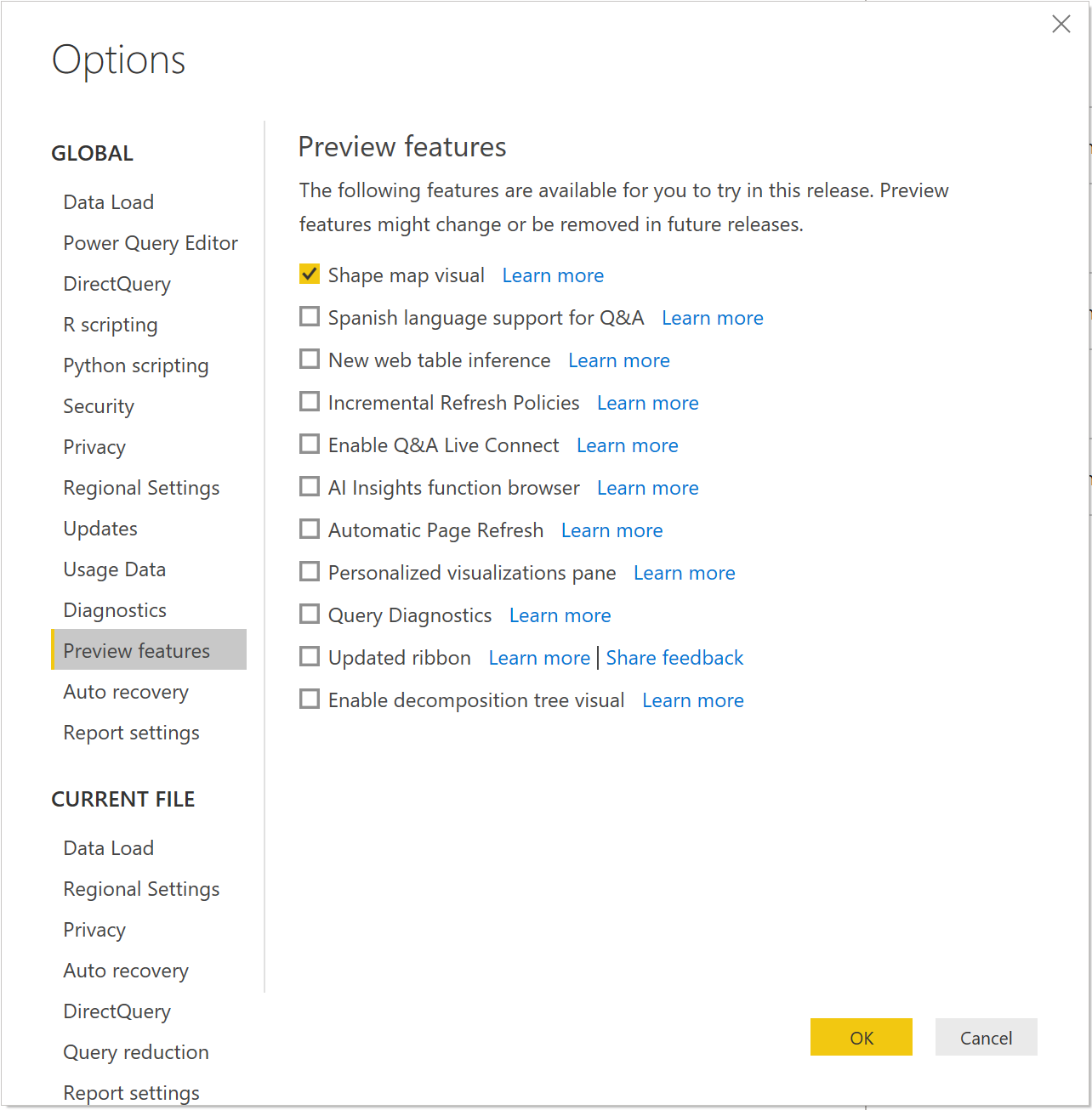
Clicking on Options will lead to the window as seen below. Ensure that Shape Map Visual is ticked. Once this is done, restart PowerBI for the changes to take effect.
All set! You should now see the Shape Map icon ![]() in your Visualisation tab.
in your Visualisation tab.
Importing Sample Data
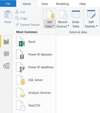
In a new PowerBI window click on Get Data and select Text/CSV.
Once the select file dialog appears, choose the provided file countydata.csv.
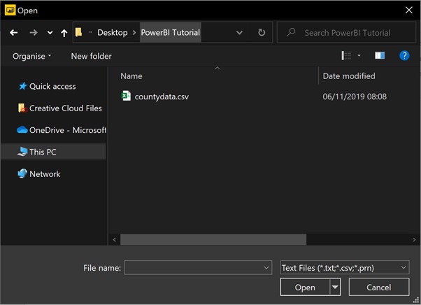
Click on Transform Data on the new window.
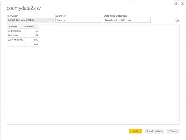
Now rename the top two columns to County and Value as shown below. Once you’ve done that click Save and Apply.
Shape Map Visual
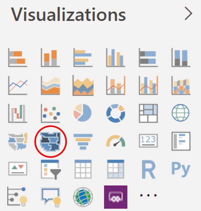
On the Visualizations pane select the Shape Map icon – the one that has a red ring around it in the below picture:
You will end up with something plain looking like this.

Not very eye-catching is it? Let’s fix that, shall we!
On the fields pane, select County and Value.
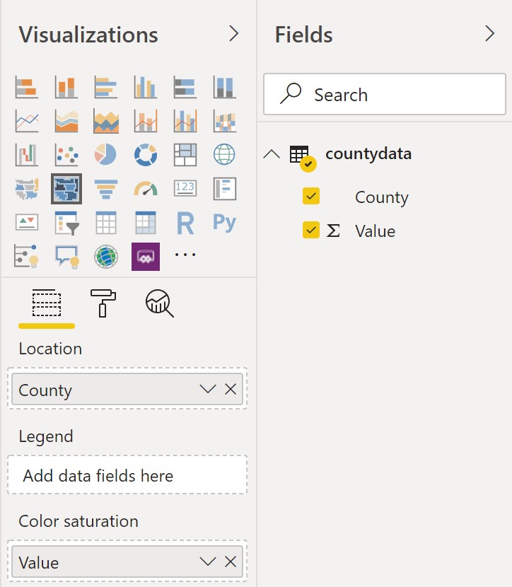
Now under the Format tab in the Visualizations pane, select Add Map and choose the uk-counties.json file from whatever directory you saved it in. Your subsequent pane should look something like this:

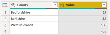
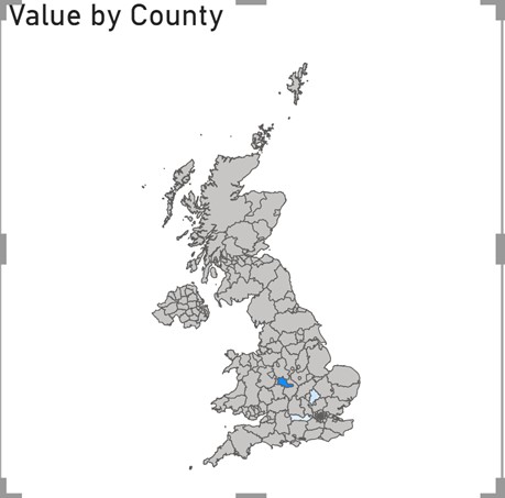
Your Shape Map should be complete. As specified by the data source, the following counties are represented in the map; Bedfordshire, Berkshire and West Midlands. I highly recommend you add more county and subsequent values in the CSV file to make the map look more distinct.
This map will help you visual data in a way that will help your business make more informed decisions, gains actionable insights, and quickly respond to a competitive market.
Special thanks to Matthew Stephen.
About the author
Jalal Uddin is a Cloud Solution Architect Intern at Microsoft, UK. He is passionate about empowering customers to learn how to use data to discover actionable insights to be more productive, more profitable, and more competitive. Jalal is completing a Computer Science Degree at Aston University.