

Transform technician experience with the new Field Service Mobile UX
We recently announced the preview of our new Dynamics 365 Field Service mobile experience. This blog details the new capabilities on how technicians can benefit from this new streamlined experience, which cuts down the number of taps required to complete a booking in nearly half!
Home Page
Upon launching the app with the new experience enabled, you will notice several things. Firstly, the styling and theming follows the Microsoft’s Fluent design system – bringing an experience like other modern enterprise apps like Teams and Office to your field service technicians.
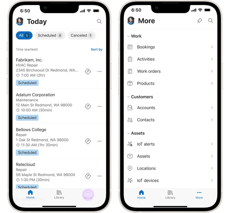
There is a new bottom navigation bar with 3 main buttons:
- Home – the landing page for the app, currently today’s bookings
- Library – for helpful reference materials such as Guides
- More – for easy access to the other areas of the app via the sitemap.
Tapping on your user avatar in the top left opens a familiar navigation menu where you can get help, provide feedback and access useful app settings, such as the ability to change your time zone and your applicable Dynamics 365 org.
Throughout the app, you will notice that touch targets are larger to eliminate mis-taps for conditions out in the field. Labels and icons, such as for booking status, are color coded for immediate visual recognition. The UX is responsive and adjusts to various screen sizes and portrait and landscape modes.
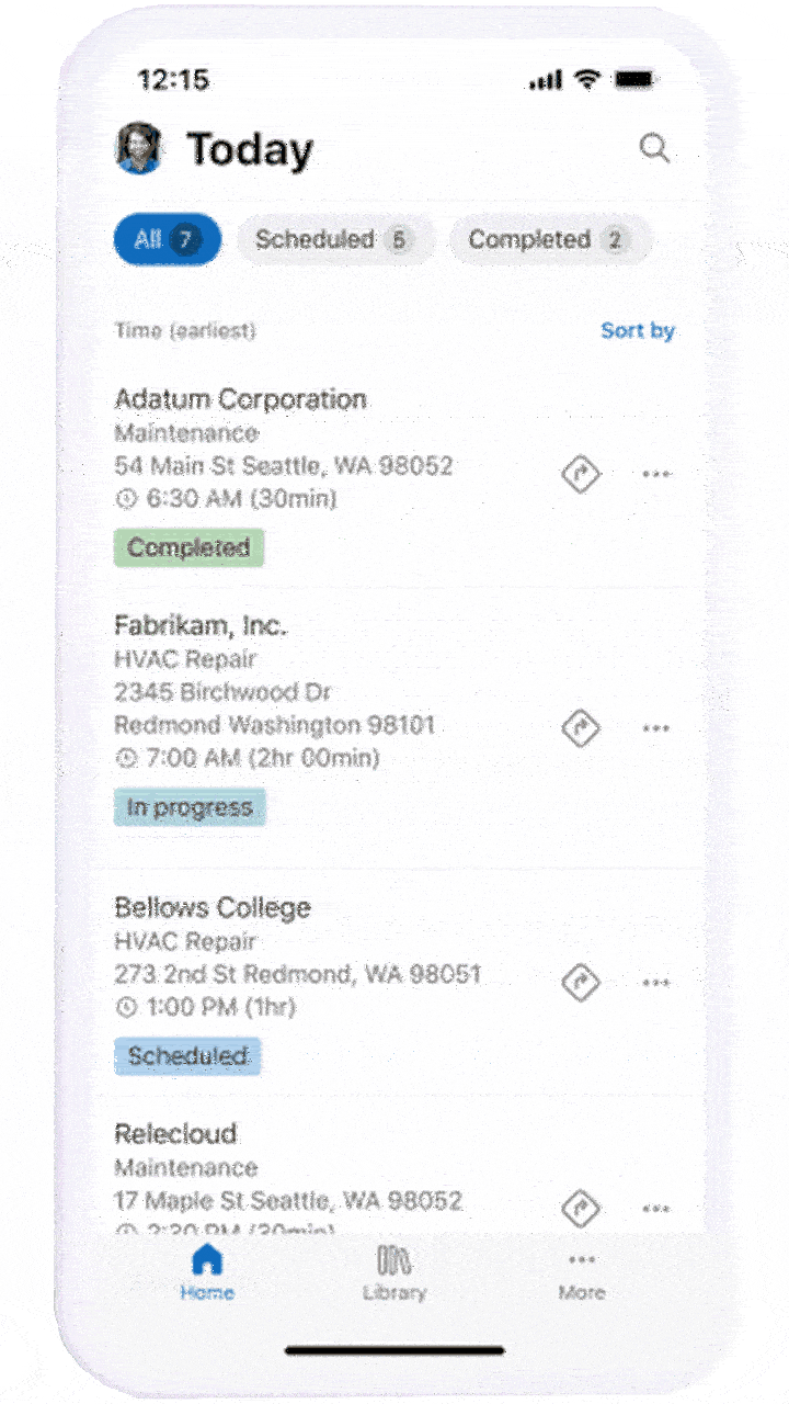
The Booking List
Every row in the booking list highlights the most important fields at a glance – such as the customer’s name, the incident type, the service address, the booking start time and the current booking status. There are one-touch filters and sorting options at the top – enabling the technician to easily filter based on booking status or sort by columns other than time.

There are also nifty timesaving shortcuts – swipe gestures to change the booking status from within the booking list and one-touch “Get Directions” button to start navigation. All of these features are designed to reduce the time required to get basic information and perform tasks. To access the booking details, simply tap on the booking from the list.
Booking details, tasks, services and products
Within the booking form, there are tabs to keep the information organized in an intuitive manner. Technicians can smoothly swipe between the tabs, instead of having to tap on them.

The General tab summarizes the key details of the booking and the associated work order. The “Edit Status” button at the bottom is both conspicuous and fixed at the bottom of the screen, making it easy to access and tap.
The one-touch “Get Directions” feature from the bookings list is available on this screen as well. Additionally, there are shortcuts to quickly start a phone call or send an email from to the onsite contact from this screen. The edit controls for the time and duration fields have also been completely redesigned using the Fluent mobile patterns. The summary field contains an expandable work description.

The tasks, products and services tabs include the list of Work Order Service Tasks, Work Order Products and Work Order Services for the current booking respectively. The tasks sub-grid has multiple UX niceties – a progress bar at the top, large tappable icons to easily check off completed tasks, a task description below each task title, links to attached Guides and Inspections (more on that in a bit) and a floating action button to quickly add tasks. The products and services lists inherit many of the same UX enhancements, with the additional features to mark an item as used and update the quantity inline.
These lists are designed to reduce the need to tap into the individual items by surfacing the relevant details and editing capabilities in the list itself.
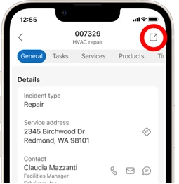
If a user needs the unified client interface (UCI) for additional booking details, they can tap on the icon on the top right of any screen. Tapping on a record that doesn’t have the new experience also takes the user to the UCI experience – for e.g., tapping into a task will currently open the UCI form.
Step by step instructions
An exciting new feature for service technicians is the ability to access their Guides on their mobile devices with the Field Service app! If the Dynamics environment contains both Field Service and Guides solutions, users can access guides from within the library tab in the bottom navigation bar. Technicians can use guides containing instructional images and branching logic to help them when they need to follow predetermined procedures or troubleshooting maneuvers.
Each guide also has an outline to enable the user to see all the steps briefly. Also, both inspections and guides can be initiated from the task list as long as they’re attached to a particular service task – surfacing the instructions in context of the work order!
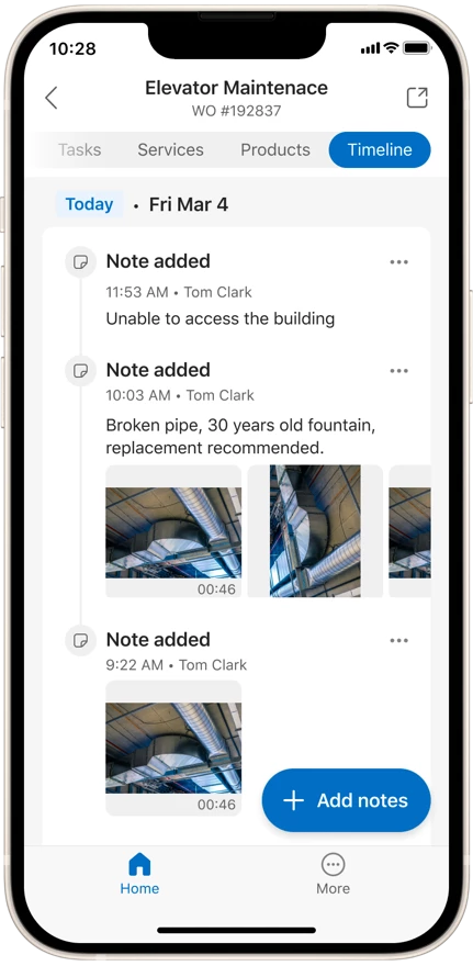
Taking notes and attaching images
Technicians will love the new timeline experience in the booking. It provides a streamlined view of text and image notes from the annotations table. It is super easy to add multiple pictures in one go by selecting them from the phone’s image gallery – or just snap away in the control itself. The image previews can also be seen inline. What’s more – rich formatted text is supported!
The new Field Service Mobile UX is packed with features simplifying the technician experience to enable them to be more productive in the field.
Try it out today by following our documentation. We are looking forward to your feedback as we bring additional enhancements, including support for our offline capabilities in the new experience as well.