
Announcing UI updates in October for sitemap and command bar
Since Unified Interface was introduced, we have been listening intently to your feedback. Something that was clear to us is that our customers found our navigation model too complex. As part of the October update, we have taken some steps to improve your experience in product navigation. The latest UI update comes with some changes to our sitemap and commanding that we hope you will like. We have made this the default experience in all newly provisioned email trial organizations. Existing organizations will get the option to opt-in through administrator options in February 2019.
The experiences we are improving
This update aims to address the following user feedback:

- Users find the sitemap difficult to navigate. They have a hard time knowing where they are in the app.
- The icons are hard to remember. It makes picking the right item to which to navigate difficult.
- It’s not clear which area the command bar controls. Commands are hard to tell apart from one another.
To address these issues, we are making the following changes:

- Sitemap is expanded and persists by default to promote user recall and learning.
- The sub area in focus is highlighted to indicate where in the app the user is.
- Recent and pinned items are moved to the top level for easy access. Entity level recent items are removed to eliminate hierarchy.
- Area switcher with flyout eliminates the cluttered tabs in the previous site map.
- Command bar background color is changed to show association with the area it effects.
- Unique colors are added to icons to create differentiation and eye stops between commands.
Site map changes
Site map is now expanded by default and persistently pinned
This will be the most noticeable change for our users. The sitemap no longer collapses automatically after users click outside or select an item. Having both the icon and the corresponding label visible, helps users recognize and learn the items instead of recalling from memory. Users can collapse the sitemap by clicking on the expand/collapse icon at the top left.
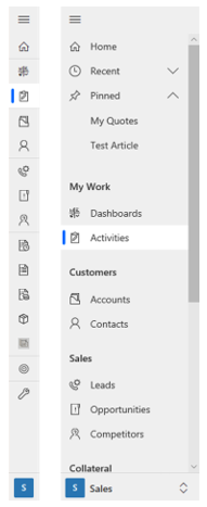
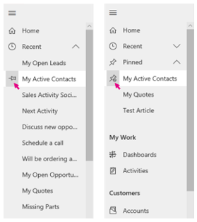
Recent and pinned items are now always visible
Since these are frequently used items, we have placed them with everything else at the top level for ease of access. We have retained the original pinning mechanism. To pin something, simply select the pin icon next to the item in the recent list, and it will be added to the pinned list. To unpin, select the unpin icon next to the item in the pinned list, and it will drop off from the list. To conserve space, only one of recent or pinned list can be expanded at a time. To further flatten the site map hierarchy, we have eliminated entity level most recently used (MRU) items.
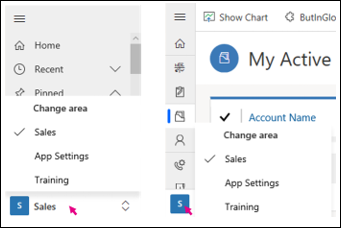
Access different areas with the area switcher at the bottom
Areas used to be organized into a clutter of tabs at the top. Now, you will find the area switcher behind an eye-catching color tile at the bottom. To reduce icon overload, we no longer support custom area icons. Instead, the tile will show the initials of the area’s name.
No more app switcher in site map
We are in the process of consolidating our app switching experience. In this transitional period, we have removed the app switcher that used to be at the bottom of the site map. To go to a different app, consider using the drop down menu in the top header.
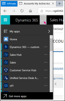
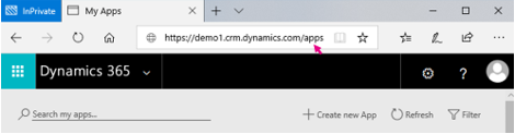
To reach the app landing page, append “/apps” to the end of the root URL.
Command changes
New background color, colorized icons, and hover effect
The color of the command bar has been adjusted to match the region in focus to create a strong association between the command buttons and the area they affect. New colorized icons serve to differentiate commands while the hover effect provides feedback to the user on where the interactive regions are for each command.

Targeted viewport width
At this time, we have made the above changes available to our largest user base: browser with widths above 480px. Single column and mobile form factors are not affected by these changes and will be refreshed in the near future.
| Environment |
Viewport width (from, to) |
Sitemap and commanding update |
| Browser | (480, ∞) | Yes |
| Browser | (0, 480) | No |
| Mobile | (480, ∞) | No |
| Mobile | (0, 480) | No |
Please give us feedback
We understand that any UI change can cause disruption to your business. We do not take this lightly and strive to address important user feedback as well as continuing to evolve our design to better support your scenarios in each update. Please let us know what you think of these changes and if there is anything we can do to make your experience even better. Feel free to comment or write to unifiedfeedback@microsoft.com.
Joseph Shum, Program Manager, Dynamics 365 engineering