

Process Advisor for Supply Chain and Warehousing.
Who should use it, why and for what?
Introduction
Performance evaluation has been revolutionized by technology, extending its reach to the individual level. Consider health apps on your smartphone. They gather data breadcrumbs from your daily activities, providing analysis of your movement patterns. This isn’t a generic data compilation, but a near-accurate reflection of your physical activity during a specific period.
In the future, it’s conceivable that these apps might be equipped with an AI companion, or Copilot, to guide your next steps based on your past activities. It could suggest rest days or additional exercise to help you achieve your personal health goals.
This concept of performance evaluation based on collected data is the bedrock of process mining and process comparison. Our Copilot functionality adds a layer of assistance, enabling you to make informed decisions about your warehouse operations.
In this context, Copilot can help you optimize warehouse processes. It can identify bottlenecks in certain processes or compare different methods to achieve the same goal, empowering you to choose the most optimal method for your specific case.
In this blog, we’ll explore the essence of this feature, its intended audience, and how and why you should leverage it for your warehousing operations.
Process Mining Insights:
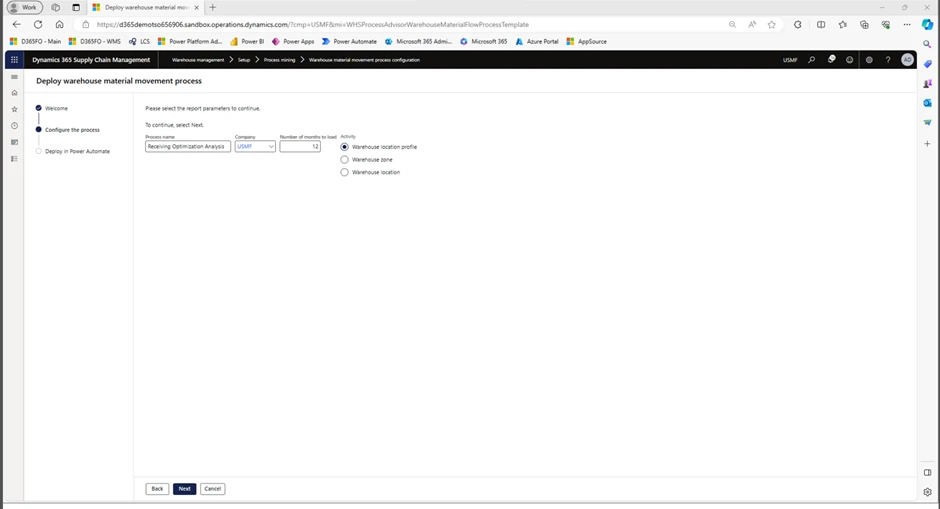
At first glance, using Process Advisor for material movement analysis is easy. The setup process is straightforward:
- Go to Warehouse Management > Setup > Process Mining > Warehouse material movement configuration. In the taskbar, select Deploy New Process.
- The configuration Wizard will open. Press Next, then enter the name of the process in the field Process Name, choose company, choose number of months to load (12 months = data from latest 12 months) and choose the appropriate Activity. Press Next.
- Process is deployed.
The configuration wizard looks like this:
The easy part is now complete. We have set up a process, named it, and loaded 12 months of data to prepare for our analysis. The difficult part is making sense of our data and using it to make decisions to improve our warehouse output.
Therefore, we will provide you with some real-life examples on how to use the data analysis functionality to understand your processes, and a scenario where we evaluate two different methods and use the Process Advisor to figure out which method would be preferred for our business operations.
Analysis of data
There are multiple ways to analyze your process data to understand and compare your processes.
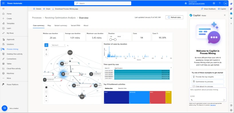
- Start with opening Power Automate and go to the tab Process Mining. The report is accessible on the main page.
- Report: When the report is loaded, it can look like this:
3. Select Map
Select the Map tab to display the process map:
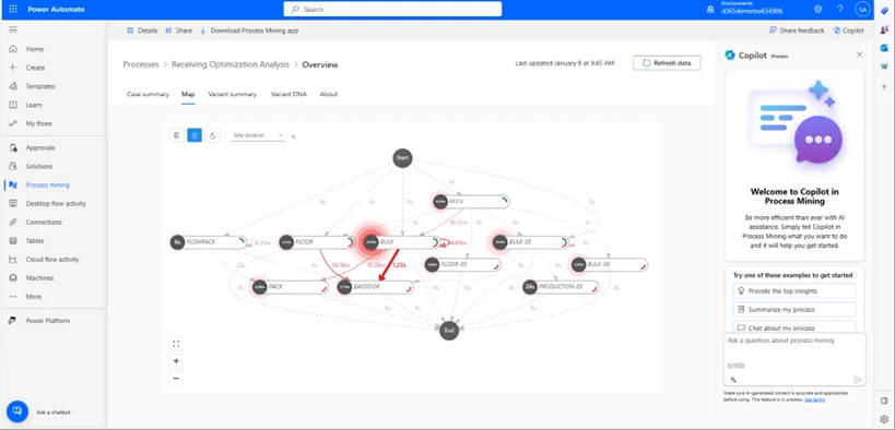
This is a screenshot of the process map from our example. On the Map, there are separate locations on which actions(tasks) have taken place, as well as the time spent on this location and between locations. You can change the time unit to, let’s say mean duration, to see how long each activity in a particular location takes per average.
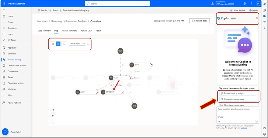
4. Use the Co-Pilot to get started.
We provide you with suggestions for frequent prompts, but you can of course choose to enter whatever you want. In this case, we will use the suggested “provide the top insights” prompt.
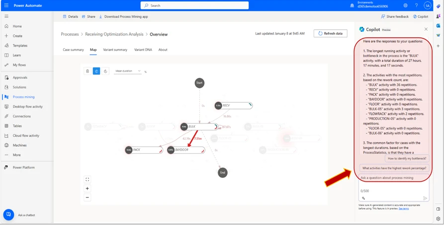
5. Copilot Generates
The Copilot generates a response based on the data in your process map. In the example, we can see that the Copilot has found the “BULK” as the longest running activity, and provided us with a list of the activities with the greatest number of repetitions:
6. Copilot Follow Up
We can also ask the Co-pilot follow-up questions. In this case, we will follow-up with the suggested “How to identify my bottleneck?” and “Find my Bottleneck” prompts. The Co-pilot generates a message explaining what the bottleneck is and its mean duration. In this instance, since we have selected the metric Mean duration, we will generate an answer reflecting this metric.
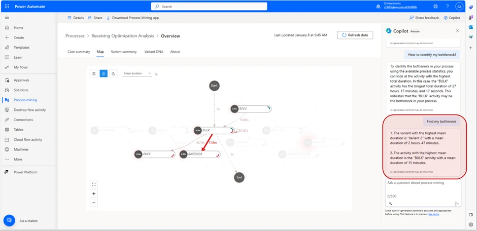
The message we receive tells us that the Variant with the highest duration is “Variant 2” with a mean duration of 2 minutes and 47 seconds.
It also tells us that the activity with the highest mean duration is “BULK” with a mean duration of 15 minutes.
From this, we can draw the conclusion that “Variant 2” is the variant that takes the longest time to complete, and that the most amount of time is spent in the “BULK” location.
By using the process advisor for warehouse movement material analysis, we can streamline warehouse operations and ensure we don’t spend more time than we need on a particular task or operation.
Another example where the Process Advisor can be utilized to enhance operational fluidity in your warehouse is by comparing different methods of achieving a similar goal, to understand which method is more effective to reach your desired goal. We will try to explain how to conduct such a comparison to with a test-case.
In our test-case, we will compare two different methods of picking goods in the Warehouse to figure out which picking method takes less time, so we can increase the Warehouse output.
Test Case : “Single order picking” vs “Cluster picking”
In this test-case, the user wants to know which method of picking is faster, “Single order picking” vs “Cluster picking”. To compare the two, the user goes through the following steps. First, the user creates a Hypothesis for the purpose of this test-case. In this case, the user wants to determine which picking method is faster.
Secondly, the user decides the scope of the test. For both methods, the user will have 5 sales orders with one to five different items per order, in different quantities. Both methods will use identical sales orders for test purposes.
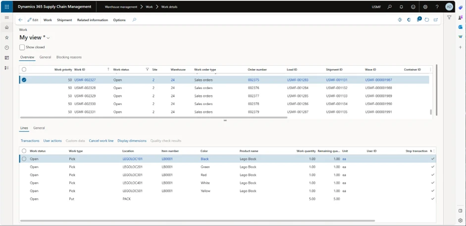
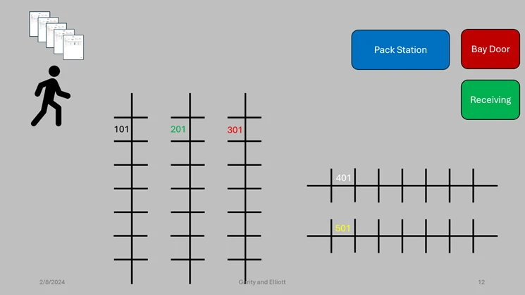
In the Work Details screen, we can see the work details for the work that has been created.
The Variants are the different Variants of work, so in this instance, for work ID USMF-002327 with Order number 002375 (displayed in the picture) the worker will “Pick” 1 piece of item LB0001 in 5 different variations (in this case colors), then “Put” these 5 items away in packing area (location “PACK”).
With the “Single order picking” method, the worker picks one order at a time and puts it in the packing location. To clarify, the warehouse worker will go to each location where the item is located, pick and scan that item, repeat the process for each item in that order, take the order to pack location and then repeat with next order.
Worker goes to 5 different locations to pick items, then proceeds to “PACK” location to put items away for packing. Then, the worker repeats the process for the other orders.
After we have constructed our hypothesis and determined the scope, we can go ahead and prepare for the analysis.
First, we will have to deploy our process comparison. We head into Warehouse Management > Setup > Process Mining > Warehouse material process configuration, and in the taskbar, we select Deploy New Process. We select a fitting description as the Process Name, select company and number of months to load. In this test case, we will only be loading one month of data since we don’t need more for this test’s purposes.
Usually, you would want as much correct data(not corrupted/faulty data since this will affect the analysis) and necessary (scope needs to determine how much and what is necessary) data as possible to get a high-quality analysis.
When our process has been deployed, we can move on to the analysis and evaluate this process.
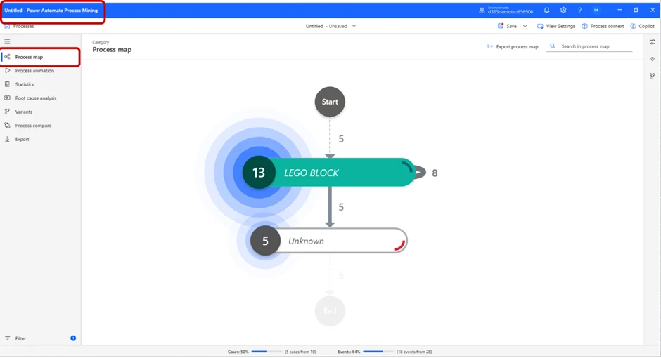
We load our process map into Power Automate, and in the beginning, it will look something like this:
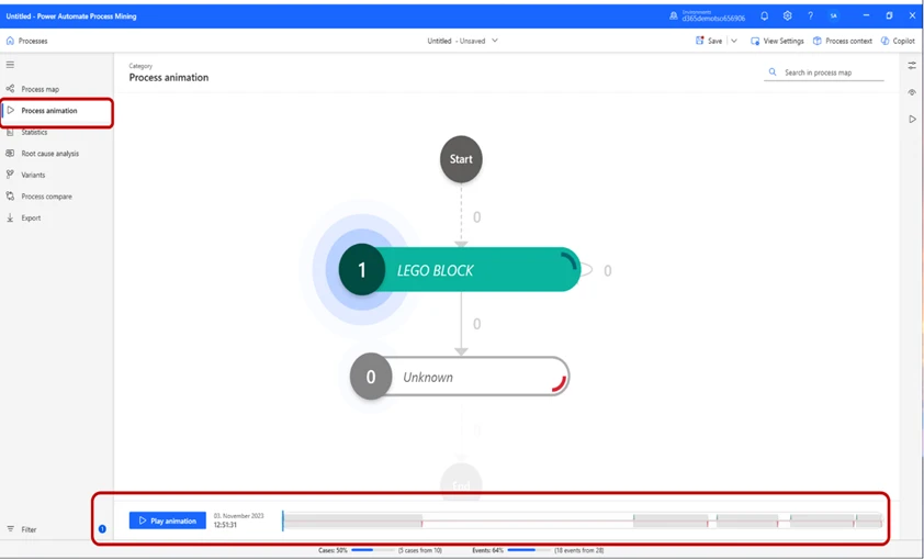
We can press the Play Animation button to get a representation of the process.
In the Statistics tab, we can see basic information of the process.
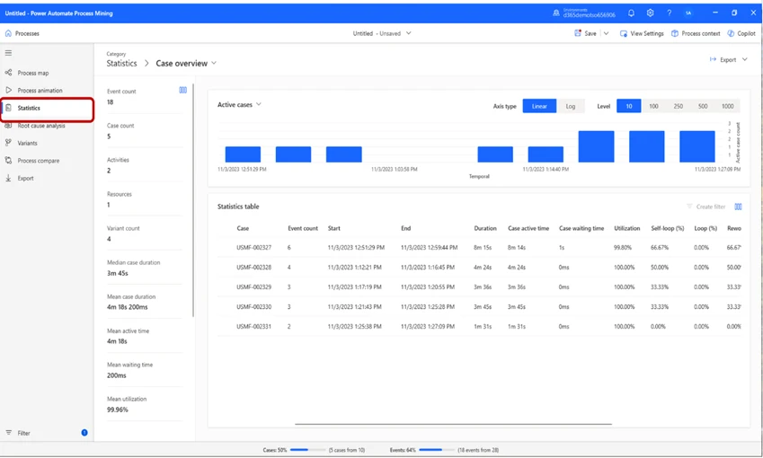
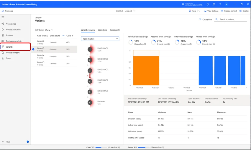
In the Variants tab, we can view the different work-Variants. By selecting one, we can get an in-depth view of, in this case, “Variant 3”. We can see that in this variant, 6 cases occurred, the total duration was 8 minutes and 15 seconds, and the total active time was 8 minutes and 14 seconds.
In this case, the attribute selected is Zone. If we look closely at the Variants, we can see that “Variant 2” has 2 cases and the others have 1.
This means that two pieces of “work” that was scheduled were so similar that they could be grouped. This is because, from a warehouse management perspective, the operation is identical. This is because the worker goes to one location, picks item(s) 1, goes to another location and picks item(s) 2, then put them away in “PACK”. Thus, it is two “Pick” operations and one “Put”, and therefore they will be grouped in this view.
We can also change the Variants’ view by changing the Attribute selected. In this case, we will change the attribute from Zone to Order number. This will change our view, so that we see different Variants based on work type. It will in this case show us 5 variants, which at first can seem confusing. A new variant is displayed with these settings, since this now displays Variants by order number instead of zone, which means that we get one variant for each Sales order we created, since all of them were different from each other.
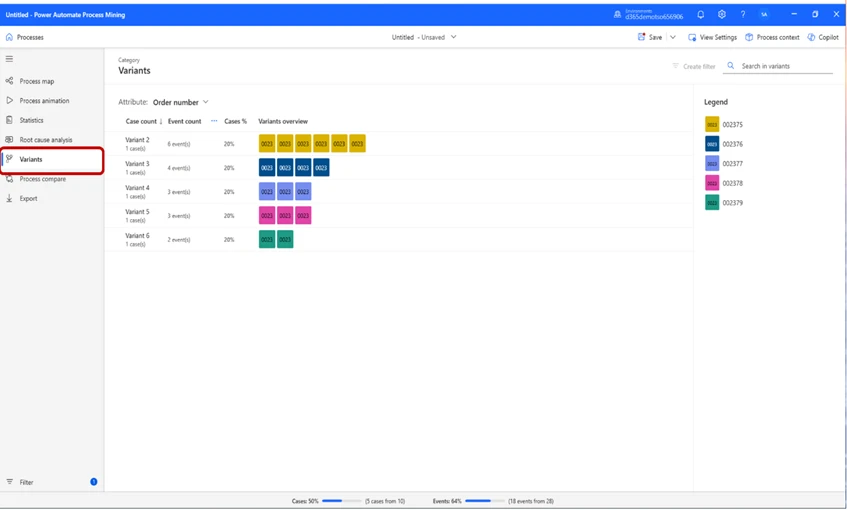
In this instance, we can see the order numbers in the legend on the right side. This view tells us that we have 5 different order numbers, and the boxes below Variants Overview represents the number of work operations performed per Order Number. The Case Count per order number, in the case of “Variant 2” there has been a total of 6 operations performed (pick, pick, pick, pick, pick, put, as mentioned previously) and in the case of Variant 4 and 5, there has been a total of 3 case count (Pick, Pick, Put).
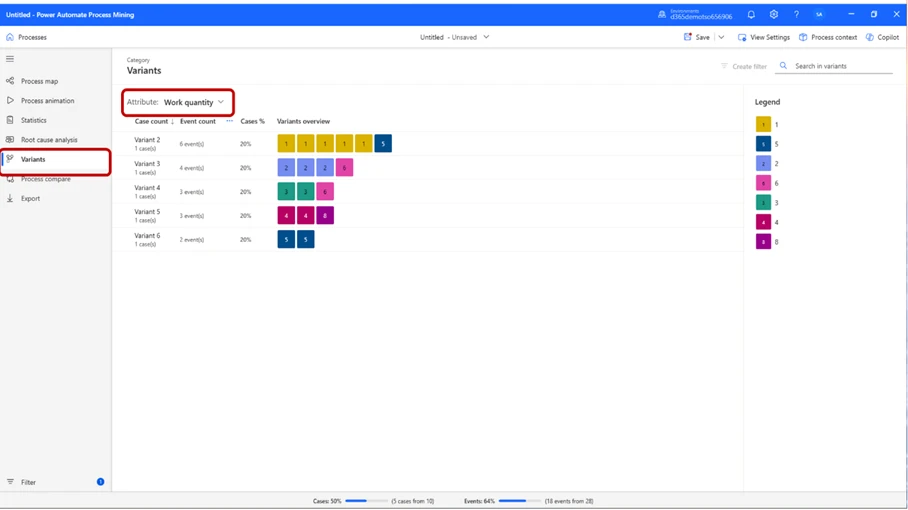
For this scenario, it can be helpful to see how much work we are performing per event. If we want a view where we can see how much work we do per event, we can switch Attribute to Work Quantity. This will in this instance allow us to see the quantity of work that needs to be performed for each event. In the example of “Variant 2” the interface tells us that 6 events have taken place, in 5 of the events quantity has been 1, and in one of the events quantities was 5. To put this into a warehouse perspective, this means that we have performed 5 of the events 1 time each, which for Variant 2 is “Pick item 1, Pick item 2, Pick item 3, Pick item 4, Pick item 5” and one event where we “Put” away these items 5 times.
That single operation is performed 5 times and counts as one event because it is the same event occurring multiple times, whilst the other event, even though they are all “Pick” events, will count as individual events due to picking different products, which are all in different locations. When we “Put” away in “PACK” location, we don’t put the items in different locations, thus it counts as one event.
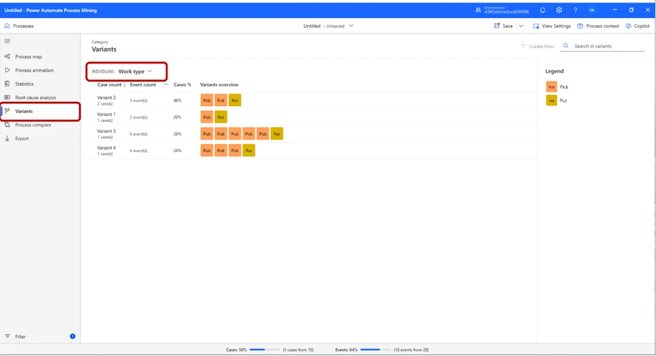
If we select Attribute by Work type, this becomes clear:
We might want to see the location where the events took place. To do that, we can set Attribute to Location, and the view will show us the locations of the events below the header Variants overview.
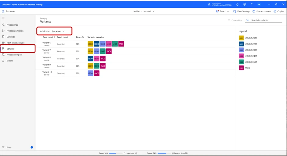
In this image, we can see the variants based on location. To put this into context, “Variant 6” tells us 6 events have taken place, all in different parts of the warehouse. For “Variant 10”, we can see that one event took place in “LEGOLOC301” and one in “PACK”.
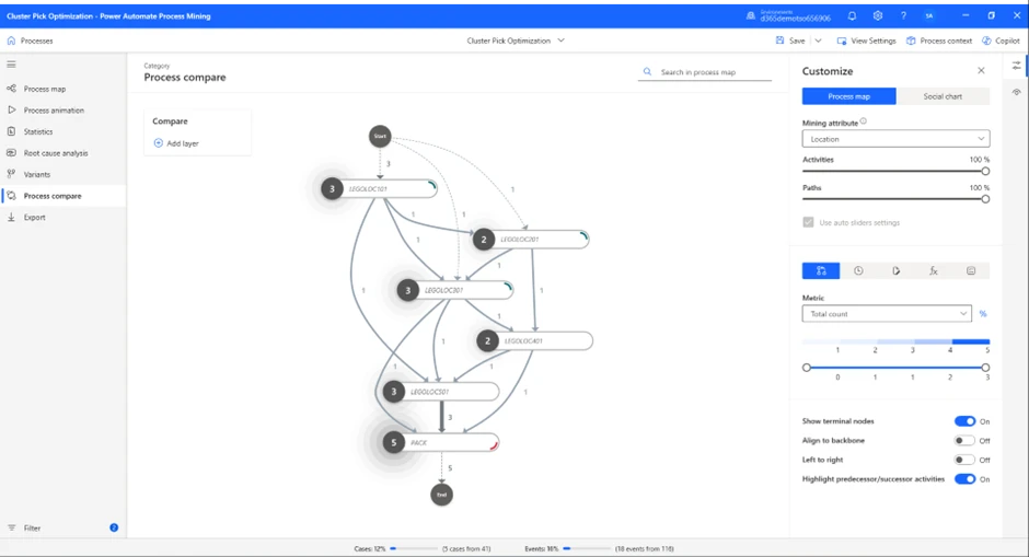
Now, after we have made ourselves comfortable within the report, we can start analyzing our process. To do that, press the Process Compare button below Variants.
A view similar to this one will appear:
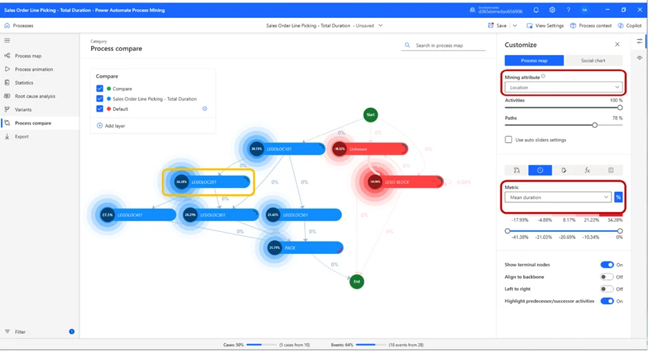
In the process map displayed on the screen, we have set the Mining attribute to Location, and the Metric to Total duration. This will allow us to see the total amount of time spent in each location.
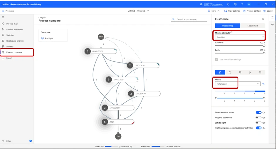
By changing the Metric to Total count, we can see the number of times an event took place in each location, as the picture below displays:
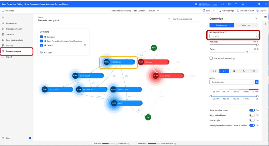
The total amount of time spent in one location and number of cases per location might be valuable, but a more telling metric could be how much time we spent on average per location.
By switching metric to mean duration, we can see the average time spent per location. This gives us yet another hint on which part of the process takes the most amount of time to manage. But, if we want to see how it looks from a proportional perspective, by toggling the percentage sign next to the Metric drop-down menu, we will achieve exactly that.
As we can see from the image above, LEGOLOC 201 is the location in which we spend the largest percentage of our time.
If we want to further examine what is going on in that location, we can do so by pressing the bar. This will change the view slightly, and a card with detailed information will appear on the right of the screen.
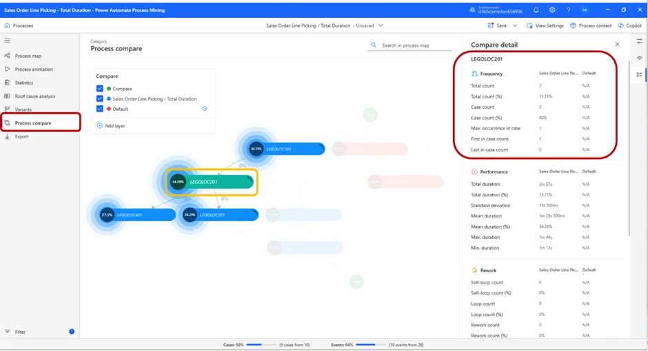
In the highlighted red box, we can see detailed performance data to further assess the performance in this location.
Now, we have enough information to draw some conclusions on our own. We have identified zone LEGOLOC 201 as our “time-thief”, and we know that more than 1/3 of the time was spent on picking items in this zone.
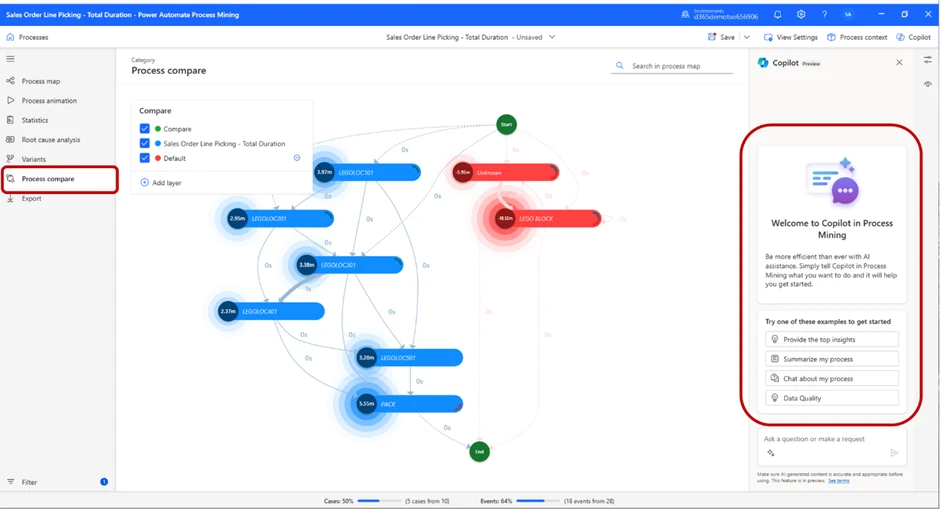
To make the analysis process easier, Microsoft’s Copilot has been built into this feature.
By pressing the Copilot sign in the top-right corner, you will open the dialogue box where you can create a prompt and ask the Copilot about your process. The Copilot will suggest some common prompts, but you can of course create your own. In this case, we will ask the Copilot to summarize our process.
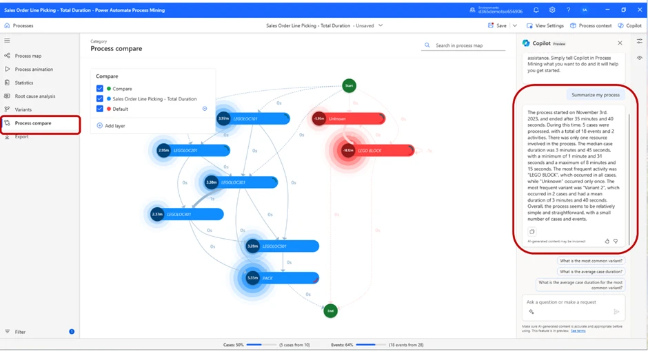
As displayed in the picture, the Copilot will give us a summary of the process. Because we have selected to compare our first part of the test vs our default value (the red locations), it also summarizes the default value’s process.
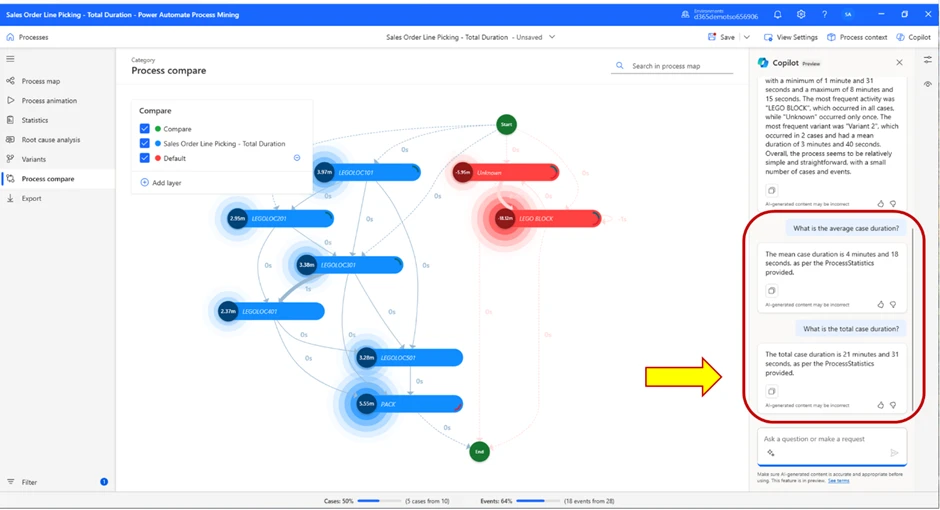
We do get some information on how many events took place etc., but we did not get the total case time, which was the value we wanted to find to confirm or deny our hypothesis. By asking the Copilot what the average case duration and the total case duration was, we received the answer that mean case duration was 4 minutes and 18 seconds, and total duration was 21 minutes and 31 seconds.
So, our answer in this case is that the Single order picking took 21 minutes and 31 seconds to complete.
Now, we will compare the result to the cluster picking method, to see how they compare.
For context, cluster picking differs from single order picking in the sense that in cluster picking, workers pick multiple orders simultaneously and not one at a time. In this case, it means the worker will pick all 5 sales orders, then put them all away in the packing station at the same time, rather than picking an order, putting them away in the packing station, and repeating for next orders.
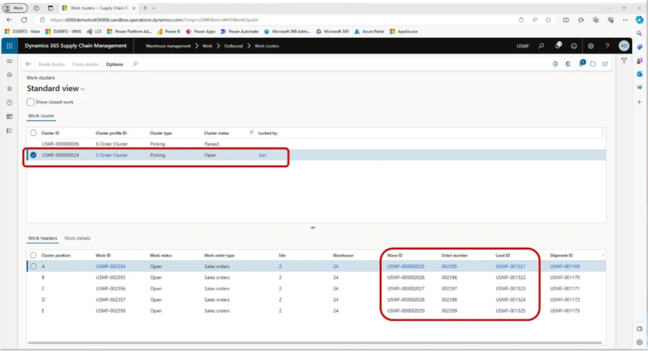
In this image, we can see the main difference between these picking methods. For cluster picking, we can see that the warehouse worker is tasked with picking 8 pieces of red Lego blocks (left image), and in the second screenshot (right) we can see how many and from which specific positions items should be picked.
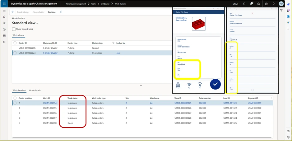
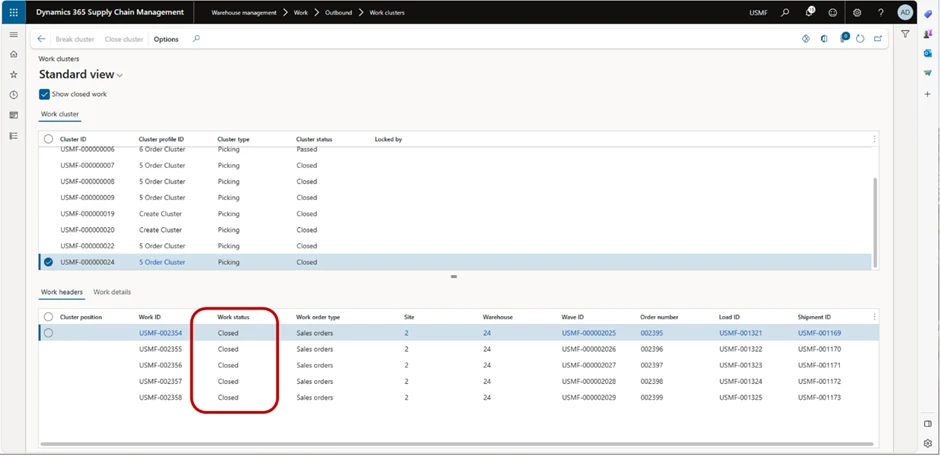
When all items have been picked, the Work status will be updated so all Cluster positions are “In process”.
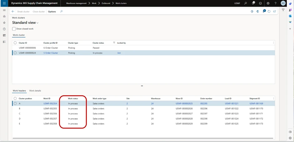
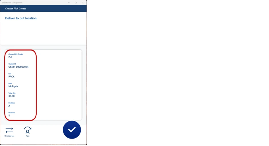
Next task is to put all items in the packing station. When we have done that, all Cluster position Work statuses will be changed to Closed.
As we can see in the image below, work status has been changed to Closed across the board.
Now, let’s jump back to the analysis. Start by creating a new process in the same way we did for single order picking and open the process map in Power Automate. In our test case, this is what we are shown on our screen.
As we have already covered how choosing different metrics affects the process map and the information on display, we will not do that for this part of the test, since we know we need to compare location as the Mining attribute, and total duration as the Metric.
We will again use the help of the Copilot to evaluate the process map. Once again, we ask for a summary of the process.
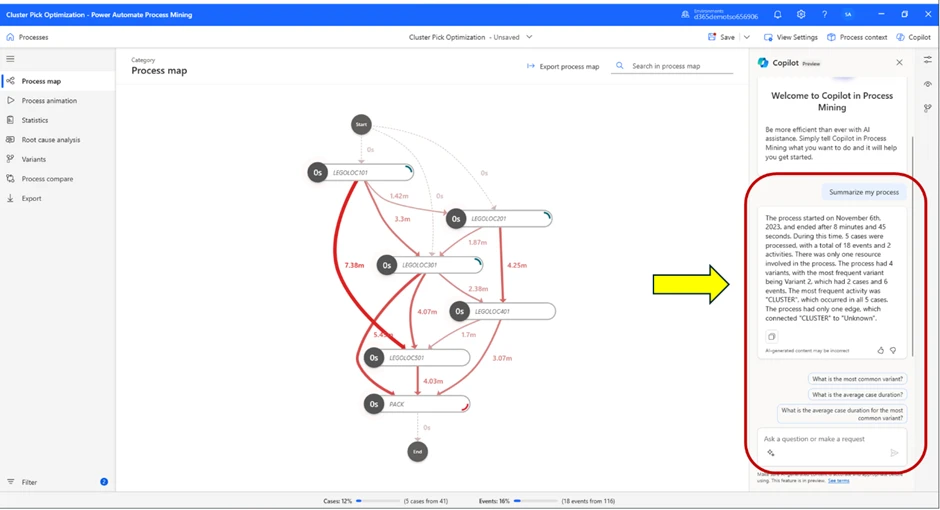
Test Case Results
The summary from the Copilot tells us that this process started November 6th and ended after 8 minutes and 45 seconds.
This means we have successfully confirmed our hypothesis by using process mining and the process advisor.
Now we know for a fact that for one picker with 5 sales orders constructed in this manner, cluster picking is a much more efficient picking method compared to single order picking, since identical amount of work took significantly less time to complete. Therefore, we can draw the conclusion that for all work with similar characteristics, we should prefer using cluster picking over single order picking, at least if we want to increase warehouse output.
Keep in mind, harnessing the power of Process Advisor requires an analytical mindset and a structured approach. The sheer volume of headers, variants, locations, and numbers can be overwhelming. To navigate this complexity, emulate the structured methodology illustrated in this example. By having a clear understanding of your comparison and measurement objectives, and a strategy to achieve them, you’ll significantly enhance the outcomes derived from Process Advisor.
Essential skills for effective process mining:
Use a fact-based approach with warehouse data as the base.
- Use a strategic and tactical approach throughout the analysis.
- Unlike this example, a great way of using process mining is by using continuous analysis, where you monitor something over time, rather than one-time analysis, which it can also be used for, as in this example.
- Use quick data for immediate insights, and big data for continuous and conclusive analysis.
- Master filtering to gain valuable insights and sort out what you believe is important.
Wealth of achievements made possible through process mining:
- Identify areas in which processes can be improved.
- Validate conformance of processes.
- Do process simulation and predictive analysis.
- Discover the most optimal paths for automatization.
Conclusion:
The power of Process Advisor extends far beyond what we’ve explored in this blog. It’s a versatile tool that can be adapted to a myriad of scenarios, and this guide merely scratches the surface of its potential. We’ve used it here to streamline warehouse operations, but the possibilities are truly limitless.
We encourage you to dive in and experiment with Process Advisor. Use the scenario we’ve outlined as a starting point, but don’t stop there. Input your own warehouse data and see firsthand how Process Advisor can illuminate opportunities for efficiency and growth. The journey towards optimizing your warehouse output begins with the Process Advisor.
Learn More
Related documentation:
Overview of process mining in Power Automate – Power Automate | Microsoft Learn